App Bemol
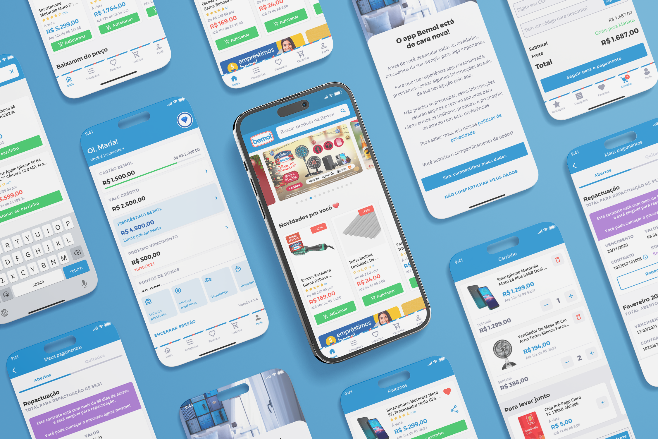
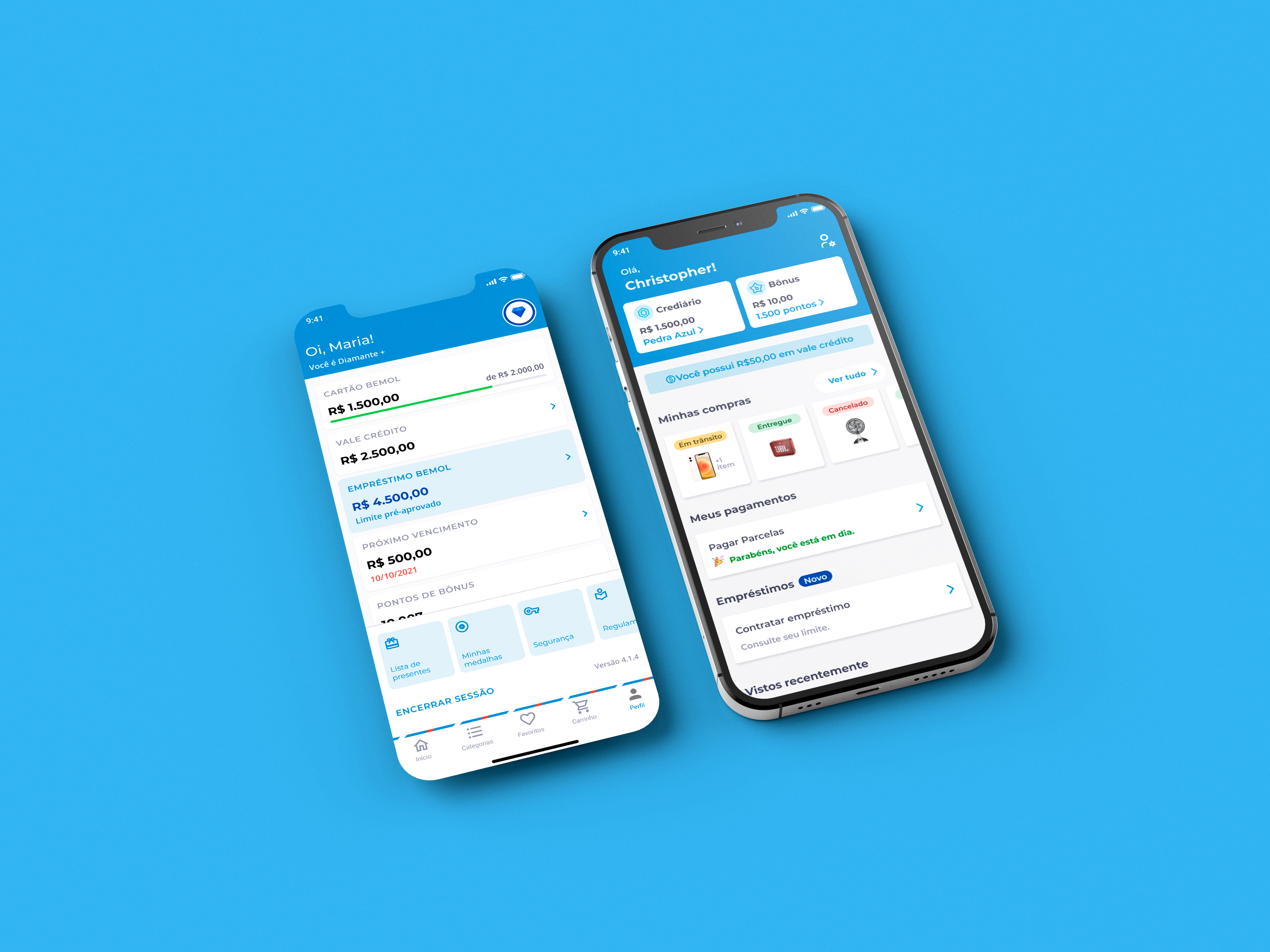
The Bemol app connects the company with its customers, offering a platform for purchases, payments, and account management. In August 2021, the app was reformulated to improve purchasing, payment processing, and brand engagement. Launched during the COVID-19 pandemic, the focus was on moving fast to meet customer needs, with a clean, modern design that stayed true to Bemol’s brand.
Company
Bemol
Scope
Product Design
Role
Product Designer
Channels
App Bemol
Status
Launched · 2021

Process
The Bemol app is the main channel between the company and its customers for purchases, payments, installments, and account management.
Impact of COVID-19
Because of the urgency, most of the discovery stages were skipped in favor of speed. Design decisions were based on the team's market experience rather than formal research.
At a certain point in the deliveries, it was decided between Product Designers, Product Owner and Product Managers, to test the Bemol app product information disposal for having a different proposal from retail market.
Testing
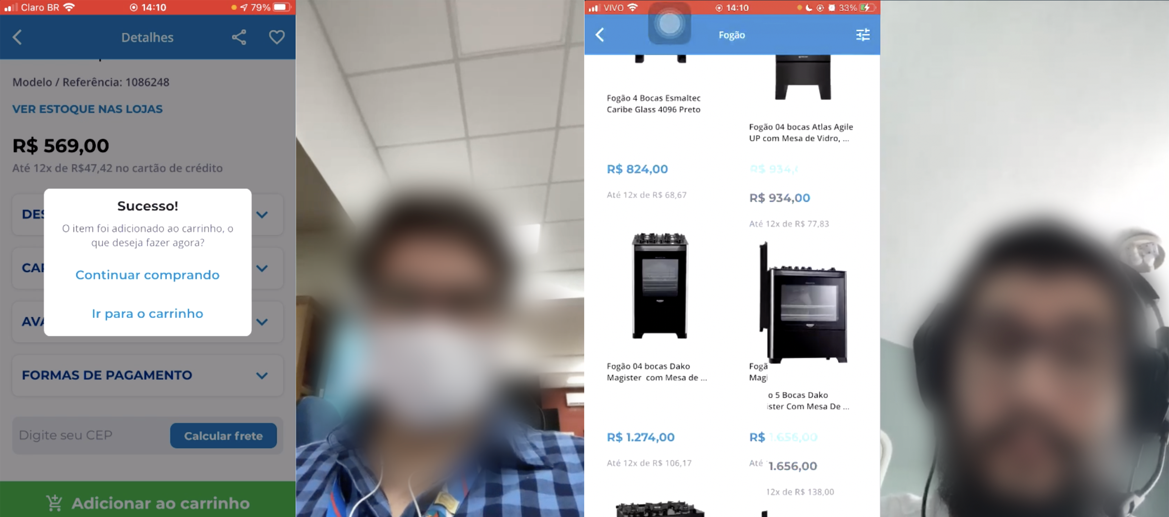
The testing phase consisted of three tasks with distinct goals, including gauging initial impressions, identifying the most frequently used product discovery methods, and evaluating the product detail page.
Test artifacts included: a test plan, a script with tasks and interview questions, and the app in a controlled production environment. The plan and script were developed by the Product Designers and approved by the PO.

Outcome
What worked: Brand identity preserved
Most participants were impressed with the visual design — clean, modern, and clearly Bemol. The product screen also got strong feedback for making information accessible through "drawers."
What needed fixing
The main issue that came up was the search. Participants struggled to find products accurately, pointing to gaps in accessibility and taxonomy that needed attention before launch.
After the tests, we ran a prioritization exercise with the team to define the most critical improvements and build an action plan from there.
Launch
For launch, we redesigned the product card to handle longer product names, added a card with product attributes and classification, and included an "Add" button directly in the product card component.

